Marketing · 12 Oct 2026 · 14 min
Breadcrumbs in a website: what the trail is for, and what Google does with it
A breadcrumb trail shows where a page sits in a site, with a link to each level above it. When a site needs one and when it does not, how to build it for people, screen readers and Google, and what I found when I checked 14 guides to breadcrumbs for a trail of their own.
A breadcrumb trail is the short row of links near the top of a page that says where the page sits in the site: Home › Women › Sarees › Silk sarees. Each step is a link to the level above, and the last one is the page you are on. It answers the two questions a visitor has the moment they land somewhere deep, from a search or a shared link: where am I, and what else is here?
The name comes from Hansel and Gretel, who drop breadcrumbs to find their way back through the forest. In the story it does not work, because the birds eat them. A website's trail does a different job anyway. It does not show the way you came. It shows the way up.
The siteevery page
- Home
- Women
- Sarees
- Silk sarees
- Kanjivaram sareeyou land here
- Banarasi saree
- Cotton sarees
- Silk sarees
- Kurtas
- Sarees
- Men
- Sale
- Women
The pagefrom a Google search
- Home
- Women
- Sarees
- Silk sarees
- Kanjivaram saree
One tap on Silk sarees and the visitor is browsing the category, not heading back to Google
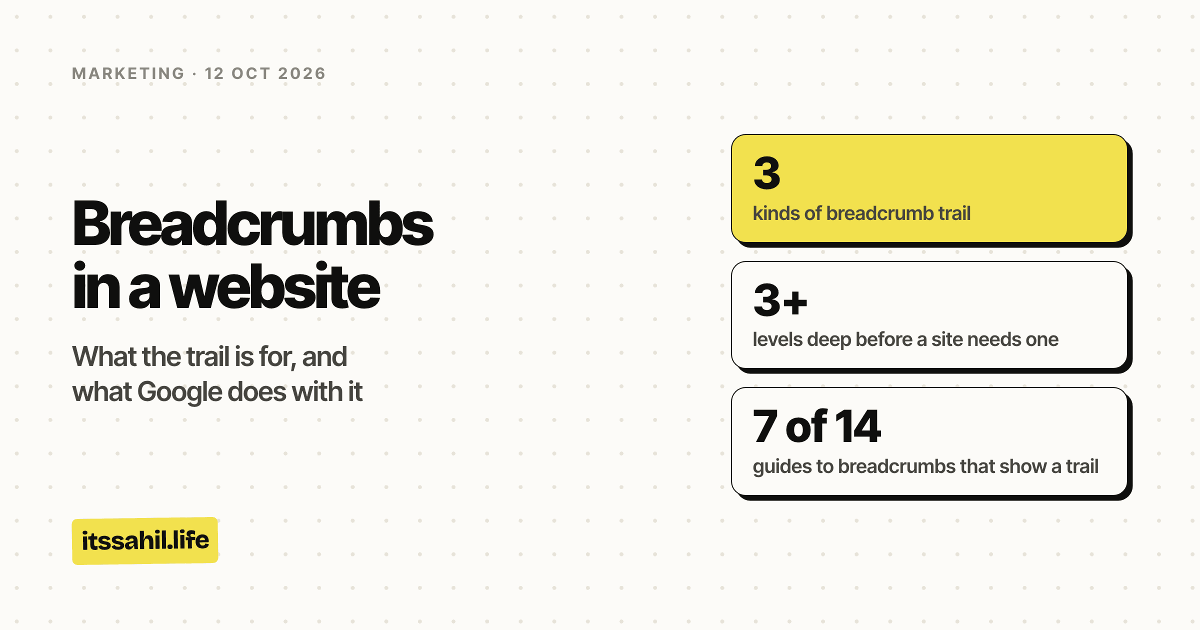
- kinds of breadcrumb trail
- 3
- levels deep before a site needs one
- 3+
- guides to breadcrumbs that show a trail
- 7 of 14
- the only Google results that still show one
- Desktop
The short version
- What it is: a row of links, one for each level of the site above the current page, ending with the page itself as plain text.
- What it is for: someone who lands deep in a site can see where they are and go up a level in one tap, instead of going back to Google.
- Who needs one: sites with real depth, such as shops, documentation and large blogs with sections. A site one or two levels deep does not, by Nielsen Norman Group's guidelines.
- Google shows the trail in the URL line of desktop results, and has not shown it on phones since 23 January 2025. BreadcrumbList markup is how you give it the names.
- SEO: Google does not present the markup as a ranking signal. The trail's links are the useful part, because every page links to the sections above it.
- Building it: a labelled
nav, an ordered list of links, the current page last and unlinked, and separators drawn in CSS so screen readers skip them.
Three kinds of trail
| Kind | What it shows | Example | Use it for |
|---|---|---|---|
| Hierarchy, or location | Where the page sits in the site | Home › Women › Sarees › Silk sarees | Almost every trail worth building |
| Attribute | The filters that describe a product | Sarees › Silk › Maroon | Shops where people narrow a category with filters |
| History, or path | The pages this visitor clicked through | Home › Search results › Page 2 › This saree | Rarely: the Back button already does it |
Hierarchy trails are the standard kind, and the rest of this piece is about them. They come from the site's structure, so every visitor sees the same one, and they work for someone who arrived from a search and never saw the pages above.
Attribute trails are hierarchy trails with filters on the end. They help in a shop where silk and maroon are things people choose. Every crumb is a link, though, so link only the combinations that are real pages you want found. A trail that links every filter combination hands crawlers a pile of near-identical addresses.
History trails list the pages one visitor clicked through. Nielsen Norman Group advises against them: the Back button already does that, the list gets long and repetitive, and it means nothing to someone who arrived from outside. The one history link shoppers do use is "Back to results" on a product page. In Baymard Institute's testing, the most common use of breadcrumbs was getting back to the category someone had just come from, and Baymard recommends that link alongside the hierarchy trail, not instead of it.
Does your site need breadcrumbs?
The guidelines most people cite are Nielsen Norman Group's, written by Page Laubheimer in 2018 and last reviewed on 1 September 2026. They are clear on two points.
The trail supplements the main navigation and never replaces it. It shows the levels above one page, which is no help to someone looking for a page in a different branch.
And a site only one or two levels deep does not need one to help people find their way. On a small site, clearly showing the section a page belongs to does the same work.
A rough test, then:
- Yes: a shop with categories and subcategories, documentation with chapters and pages, a news or content site with sections inside sections, anything where search sends people to pages three or more levels down.
- Probably not: a site with a handful of pages, a blog where every post sits directly under one listing page, a landing page.
- Never as a substitute for the menu, for search, or for related links. A trail answers "what is above this?", not "what else might I want?".
This site is in the second group. Every post is two levels below the home page, and the Marketing link above the title of this page is the section label NN/g suggests instead. If the marketing section grows sections of its own, that changes.
What 14 guides to breadcrumbs do themselves
To see how the advice holds up, on 12 October 2026 I opened 14 well-known guides to breadcrumbs, from Google, the W3C and NN/g to SEO tool companies and agency blogs. On each I checked two things: whether the page shows a breadcrumb trail, and whether its code carries BreadcrumbList markup for Google. I used desktop Chrome, read the markup out of each page's structured data, and checked every page that seemed to have no trail by eye.
| Guide | Trail on the page | BreadcrumbList markup |
|---|---|---|
| Google Search Central | Search Central › Documentation | Yes, the same plus the page |
| HubSpot | Home › Marketing › the post | Yes, the same |
| Yoast | SEO blog › Site structure › the post | Yes, with Home in front |
| SEOZoom | Home › Blog › SEO & Content › the post | Yes, the same |
| Semrush | Semrush Blog › SEO › Technical SEO | Yes, a different path: Semrush › Blog › the post |
| Ahrefs, SEO glossary | SEO Glossary | Yes, with Ahrefs and the page added |
| Baymard Institute | Free UX Research › Research Articles › the post | No |
| Single Grain | None | Yes: Single Grain › SEO › the post |
| Nielsen Norman Group | None | No |
| W3C, ARIA breadcrumb pattern | None | No |
| Shopify | None, a "Blog • Conversion" label | No |
| Sitebulb | None, topic tags | No |
| Yotpo | None, an "Insights" label | No |
| Smashing Magazine | None | No |
Three things stood out.
Half of them show no trail, and that is mostly fine. NN/g's article sits directly under its articles listing, which by its own guideline is too shallow to need one. Shopify and Yotpo put the section name above the title instead, which is the alternative NN/g suggests. The sites that do show a trail are the ones with real sections to show: HubSpot's Marketing, Yoast's SEO blog and Site structure, Semrush's SEO and Technical SEO.
The markup does not always match the trail. Semrush's page shows Semrush Blog › SEO › Technical SEO, and its markup describes Semrush › Blog › the post. Google allows more than one trail per page and does not require the home page or the page itself, so neither is wrong by the letter of the documentation. But readers and Google are being shown two different paths.
One page has the markup and no trail. Single Grain's guide carries BreadcrumbList markup for Single Grain › SEO › the post, and shows no trail on the page. Google's general structured data guidelines say not to mark up content that is not visible to readers of the page. I cannot tell from the outside whether Google treats that as a problem, but it is the one combination Google's own rules argue against.
Baymard's page, with a trail and no markup, is the least of these. The trail does its job for readers either way. The markup only ever changes what Google shows.
How Google uses breadcrumbs
The URL line of a result is a domain and a breadcrumb. That is how Google's own guide to the parts of a results page describes it. The breadcrumb is the trail of the page's position in the site, and BreadcrumbList structured data is how a site tells Google what goes there: the names of the levels, in order, with a link for each.
Desktopdomain and breadcrumb
The names come from the page's BreadcrumbList markup.
Phonedomain only
Same page, same markup. Google stopped showing the trail on phones on 23 January 2025.
Only on desktop. On 23 January 2025, Google stopped showing breadcrumbs in mobile results, in every language and region, because the trail was getting cut off on small screens. A phone result now shows just the domain. Desktop results kept the trail, Google said sites using the markup did not need to change anything, and the breadcrumb report in Search Console carried on. Google's breadcrumb documentation, last updated on 8 September 2026, still lists the feature as available on desktop.
So before you spend a day on markup, open the Performance report in Search Console and compare clicks by device. If most of your search visitors are on phones, the markup changes what a minority of them see.
What Google asks for. The markup is a BreadcrumbList holding a list of ListItems, each with a position, a name and the URL of that level. A few details in the documentation save effort:
- The last item, the page itself, does not need a URL. Google uses the page's own.
- You do not have to include the home page or the page itself at all.
- A page can carry more than one trail, for a product that sits in two categories.
- JSON-LD, microdata and RDFa all work.
- Google recommends a trail that follows the path a typical visitor would take to the page, rather than one that mirrors the URL.
That last one matters more than it sounds. A product's address is often something like /p/48213, and its trail should still name the sections a shopper would recognise.
Does it help rankings? Google's documentation describes the markup in terms of how a result is shown and how Google categorises the page, and does not present it as a ranking signal. The trail on the page is another matter. Google says it uses links to find new pages to crawl and as a signal of what pages are about. A breadcrumb trail is a set of ordinary links, with plain descriptive anchor text, from every page up to every section above it. On a large site that adds up to a lot of consistent internal links pointing at category pages, which are often the pages you most want found.
Check it. The Rich Results Test validates the markup on a single URL, and the breadcrumb report in Search Console lists problems across the whole site once Google has crawled it.
How to build a breadcrumb trail
The code is small. This is the trail from the shop above, following the W3C's ARIA pattern for breadcrumbs:
<nav aria-label="Breadcrumb" class="crumbs">
  <ol>
    <li><a href="/">Home</a></li>
    <li><a href="/women">Women</a></li>
    <li><a href="/women/sarees">Sarees</a></li>
    <li><a href="/women/sarees/silk">Silk sarees</a></li>
    <li aria-current="page">Maroon Kanjivaram silk saree</li>
  </ol>
</nav>
- A
navwith a label. The W3C pattern puts the trail in a navigation landmark labelled Breadcrumb, so a screen reader user can jump straight to it and hear what it is, the way they would the main menu. - An ordered list, because the order is the point.
- The current page last, and not a link. NN/g's reason is simple: a link to
the page you are already on does nothing. Mark it with
aria-current="page". - Real pages only. Every crumb should link to a page that exists. A level that is only a heading in the menu, with no page of its own, should not be a crumb.
Draw the separators in CSS. The W3C example adds them with CSS precisely so that screen readers do not read one out between every link. A border turned 45 degrees makes a chevron with no text in it at all:
.crumbs ol { display: flex; flex-wrap: wrap; align-items: center; gap: .5em; list-style: none; padding: 0; }
.crumbs li + li::before {
  content: ""; display: inline-block; width: .4em; height: .4em; margin-right: .5em;
  border-top: 1.5px solid currentColor; border-right: 1.5px solid currentColor;
  transform: rotate(45deg);
}
Put it under the menu, above the title. Smashing Magazine's long guide to breadcrumbs, by Vitaly Friedman, makes the case for that spot: under the global navigation, and visible without scrolling. Smaller than the body text is fine. Too small to tap is not.
On a phone, keep it to one line. NN/g says a trail that wraps onto a second line stops reading as a chain, and that tap targets need to be at least 1 cm square. Its fix is to shorten the trail on phones to the last level or two, and a single link back to the parent is a common version of that. On desktop, show the whole trail.
@media (max-width: 600px) {
  .crumbs li:not(:nth-last-child(2)) { display: none; }
  .crumbs li:nth-last-child(2)::before { transform: rotate(-135deg); }
}
That hides everything but the parent and turns its chevron round to point back, so the trail reads "‹ Silk sarees". The shop page at the top of this article does the same on a narrow screen.
Then add the markup, describing the same trail. In JSON-LD:
<script type="application/ld+json">
{
  "@context": "https://schema.org",
  "@type": "BreadcrumbList",
  "itemListElement": [
    { "@type": "ListItem", "position": 1, "name": "Women", "item": "https://shop.example/women" },
    { "@type": "ListItem", "position": 2, "name": "Sarees", "item": "https://shop.example/women/sarees" },
    { "@type": "ListItem", "position": 3, "name": "Silk sarees", "item": "https://shop.example/women/sarees/silk" },
    { "@type": "ListItem", "position": 4, "name": "Maroon Kanjivaram silk saree" }
  ]
}
</script>
Home is left out, which Google allows, and the last item has no URL, so Google uses the page's own. On WordPress, Yoast SEO and Rank Math can both print the trail and add this markup for you. Pick one source for it, the plugin or the theme, or the page ends up with two trails.
Mistakes worth checking for
- A trail that copies the URL. Name the levels a visitor would recognise, not the folders the address happens to have.
- The current page as a link. It goes nowhere. Plain text, with
aria-current="page". - Crumbs for pages that do not exist. A level with nothing behind it is a dead end in the one place a visitor goes to find a way out.
- A trail instead of a menu. It shows the levels above, never the branches beside.
- Markup that disagrees with the trail, or markup with no trail at all. Describe the path the reader can see.
- A trail that wraps on a phone, or links too small to tap. Shorten it to the parent.
- Separators typed into the text. A literal › or / between links can be read out by a screen reader. Draw them in CSS.
The short answer for a site owner
If your site has sections inside sections, add a hierarchy trail: under the menu, above the title, current page last and unlinked, shortened to the parent on phones, with BreadcrumbList markup that says the same thing. Check it in the Rich Results Test, then in Search Console once Google has crawled it.
If your site is one or two levels deep, a clear link to the section each page belongs to does the same job. It is what half the guides on this topic do on their own pages.
Either way, do not expect the markup to move rankings, or to change what most phone searchers see. A trail earns its place by what it does for the person who lands five levels deep in your site and wants to know what else is there.