Marketing · 10 Oct 2026 · 8 min
Blog writing format: the ten parts that earn their place
Most advice about blog format is really advice about length. This is the other thing: where the eye goes, what each part is for, and the three conventions that stopped working without anyone updating the guides.
Most advice about blog format turns out to be advice about length. Write two thousand words. Write for eight minutes. Hit this readability score.
Format is a different thing. It is where the eye goes when the page loads, what each part of the page is actually for, and whether a reader who is not going to read every word can still leave with the thing they came for. Most of them will not read every word. That is not a failure of your writing, it is how reading on a screen works.
Here is what earns its place, and what does not.
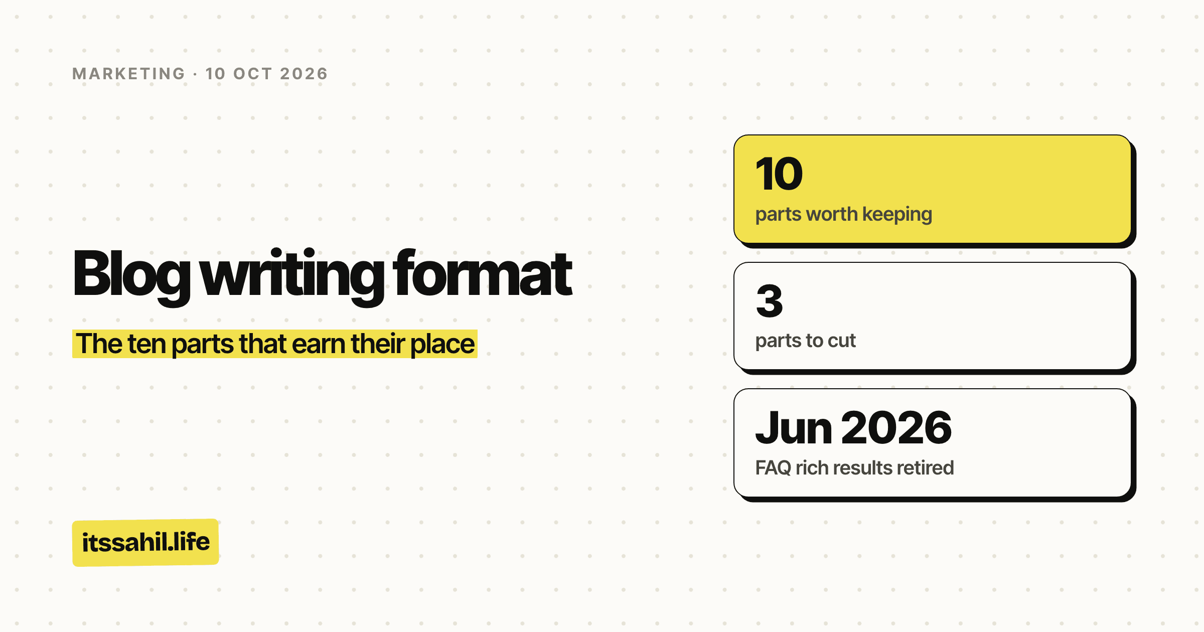
- parts worth keeping
- 10
- parts to cut
- 3
- FAQ rich results retired
- Jun 2026
- sites still eligible for them
- 0
1. A single sentence under the title saying what the reader gets
Newspapers call it a standfirst. It sits between the headline and the first paragraph, it is set differently so the eye catches it, and it does one job: it tells someone whether to carry on.
A title has to be short enough to work as a link, which means it is always slightly vague. The sentence underneath is where you remove the vagueness. Not a summary of the article, a statement of what the reader walks away with.
The test: if that sentence could sit under a different article, it is not doing the job.
2. One idea per paragraph, and let that set the length
Not "short paragraphs" as a style rule. One idea each, which produces short paragraphs on its own and produces them in the right places.
The reason is the phone, not the attention span. A paragraph that runs to four lines on a laptop runs to eleven on a phone, and eleven lines is a grey slab with no way into it. Most of your readers are on the phone. Write for the narrower column and the wider one looks generous.
3. H2s that work as a table of contents
Read only the subheadings of your draft. If you cannot describe the article from them, they are labels rather than structure.
Good subheadings are small claims. "Why the gates matter" beats "Gates". "What a backlink is actually doing" beats "Background". The second kind tells you the topic; the first tells you the point, which is the thing a scanner is looking for.
One H1, H2 for each real section, and H3 only when a section genuinely splits in two. A document that goes straight from H2 to H4 is a document nobody read back.
4. Put the numbers where the eye lands first
If a piece has figures in it, the figures are usually the reason it is worth reading, and they are usually buried in paragraph nine.
Lift them. A band of four to six numbers near the top does three things at once: it tells a scanner the piece is evidenced, it gives the whole article a spine, and it gives anyone quoting you something to quote. People link to numbers far more readily than they link to arguments.
5. A chart instead of the paragraph describing the chart
The moment you write "the majority of them were under", stop and draw it.
Prose is a bad container for distribution. A sentence can tell a reader that most of a list sat at the bottom of a range; a bar chart shows them the shape in less than a second and leaves them with an impression that survives the page. If the data is worth including, it is worth a picture.
Tables are the same answer for a different shape of data. Comparisons go in tables. Distributions go in charts. Neither goes in a paragraph.
6. Asides in the margin, not in brackets
Every piece has sentences that are true and interesting and not part of the argument. Most writers put them in brackets, where they interrupt the sentence they are attached to, or in a footnote, which nobody clicks.
Give them their own space beside the text. A short note in the margin can be read or skipped without either choice costing the reader anything, which is exactly what an aside should be.
7. An FAQ for the reader, not for the rich result
This is the one that most format guides still get wrong.
Adding FAQ schema to get the expandable questions under your search result no longer works. Google restricted that feature in September 2023 to well known, authoritative government and health sites, and then retired it altogether on 15 June 2026, removing the documentation with it. No site is eligible, because the feature is gone.
Keep the FAQ section anyway, and change why you are writing it. Real questions that real readers ask are worth answering in their own words, near the end, where someone who read the piece and still has a gap will find them. They also happen to be the cleanest thing for an AI assistant to lift when it summarises your page, which is quietly becoming the more valuable outcome.
What to stop doing is inventing questions nobody asked in order to fill a schema block. That was always obvious to a reader and now it is not even buying you anything.
8. Captions that say what the image does not
An image with no caption is decoration. An image captioned with a description of itself is worse, because it spends a line of the reader's attention telling them what they can see.
A caption should add the thing the photograph cannot carry: when it was taken, what happened immediately after, why it is in the piece at all. If you cannot write one, that is useful information about whether the image belongs.
9. An ending that is not a summary
The summary paragraph exists because school essays required one. A reader who got to the end does not need the article repeated at them in miniature.
End on the thing you would say last if you were explaining this out loud to someone. Usually that is the most pointed sentence in the piece, and usually you have already written it somewhere in the middle, where it is doing less work than it would at the bottom.
10. A format you can repeat
The last one is about the next post rather than this one. A format is only worth having if it survives being used again, which means it has to be something you can set up once and stop re-deciding.
If every piece needs its own structural argument, you will write fewer of them.
The three to cut
The warm-up. Any opening that sets the scene, explains that the topic is important, or observes that we live in a fast-moving world. Your first sentence should be the first thing you actually have to say. The warm-up is you getting going, and it belongs in the draft rather than the published piece.
Word count padding. Length that exists because a target said so. It is visible within two paragraphs, it is the single clearest signal that a piece is written for a search engine rather than a person, and the search engines have been getting better at noticing for years.
The keyword restated in every heading. Writing is not a place to repeat a phrase at a machine. The heading should describe the section. If the keyword belongs there it will arrive on its own.
The shortest version
Say what the reader gets. Keep one idea per paragraph. Make the subheadings readable on their own. Show numbers as numbers. Cut the warm-up.
The rest is preference, and preference is fine as long as you can repeat it.